Project booklet
This process book explains the development of the Data visualization project done at EPFL in the fall of 2017. It is to be read as a logbook on the advance of the project for each week we worked on it. The project's idea was to realize a visualization using D3 and other recent libraries to get a first taste in web visualization. We decided to show in an interactive way thousands of beers that were reviewed on Ratebeer.com.

Week 9
After submitting our proposal, we started thinking of a way to get the data we needed. We decided to scrap the “ratebeer” website in order to get the top 50 beers by country. We could quickly accumulate a total of 4400 beers with their respective features as: type, rating, amount of alcohol and calories. With this we started exploring and analying the data in order to get a better idea of what we will be able to do. Warning: the data used in this visualization was scraped in early November and might not reflect the actual state of Ratebeer today.
Week 10
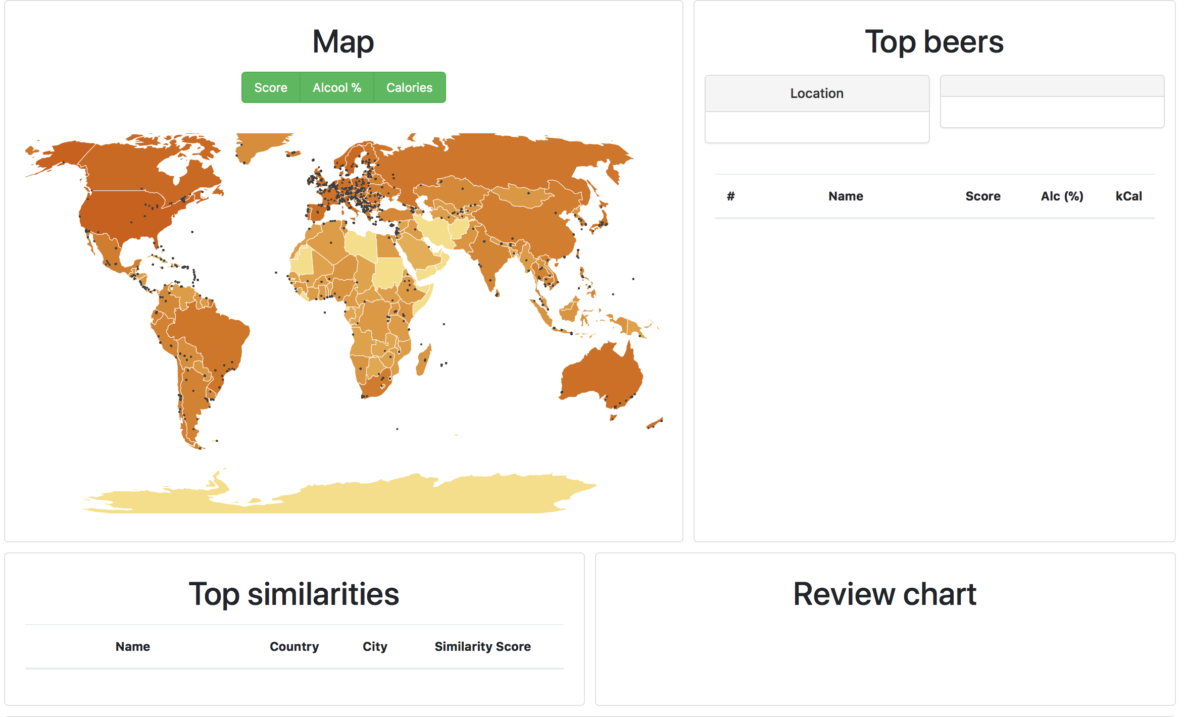
At the beginning of this week we could get a first working visualization of a map using D3. Up to there we tried to improve it in order to have a more interactive map changing parameters next to the visualization. We could thus represent a topojson map according to these parameters : “rating score mean”, “alcohol percentage mean” and “calorie mean”. Moreover, we succeed in representing each beer location by a clickable point from which we could get information about the beer and the country zooming on it (as well as the top five beers). These information are then displayed next to the map.
In parallel, we focused on having a clean and easy to use dataset. Moreover, we tried to find an interesting way to compare the different beers. We thus decided to scrap the comments used to describe each beer containing information about the taste, the smell, the sight and feel. From there we found relevant to represent these information under the form of a wheel partitioned in this way and displayed next to the map (when clicking on a beer from the top beer list of the country.) To do that, we agglomerated each comments registered on ratebeer.com for each beer. Using a “countvectorizer” from Sklearn, we managed to represent each beer with a vector defined on a “prebuilt” vocabulary used to describe the beers. We got this vocabulary from the website: Winning-Homebrew.com. Then our vectorizer, automatically added for each entry (word of our vocabulary) the number of time a given word appeared in the comments of the beer. From this vector we decided to map each word to a more general category (the one from the wheel) in order to display it as on the right figure.


Week 11
This week we focused on developing the actual website and integrate every part we had done in the previous steps. To do so we looked online for some kind of template for inspiration and decided to go with one of Boostrap starter template: Small Business template.
Week 12
After several tests, we decided to give up the idea of the edges pointing to the similar beers. The problem was, that due to the quantity of points on the map, the rendering after displaying the edges was too messy. Moreover, we would have to go up on the web page and zoom on the map to have a clear overview which for the user was a lack of time. We thus decided to list the top five beers on an array related to the selected on the beer list displayed next to the map. In order to compute the similarities, we again used the agglomerated comments for each beer that we represented under the form of a vector using the previously described approach. Then, we computed the cosine similarity between each vectors as shown below. And for every beer we could show a similarity table like this one.


Week 13
In order to give some more information to the user about each country and the beers they brew, we decided to add a bar chart with most common the types of beer in the selected country.
Week 14
In the last days of the project we spent most of our time making the website look better and being more responsive. We then wrote this process book and added a little tutorial to the visualization for first time users, using the introJS library.

Conclusion
Here is a small preview of the final look of our project. With three team members that had never done web visualization we learnt that D3 is a very powerfull tool that any developer should be able to get started with easily.
Peer Assessment
This project went very well. In each meeting we split the week's tasks in between us and every deadline was respected by each memeber. We discussed every ideas together and chose what was best for the project. Everyone contributed in every step, ideas, preprocessing, development and the visualization.
References
- https://d3js.org - D3js
- https://github.com/topojson/world-atlas - Topojson data
- https://en.wikipedia.org/wiki/ISO_3166-1_numeric - Country code
- https://bl.ocks.org/mbostock/2206590 - Zooming
- http://codecaching.blogspot.ch/2015/12/radial-bar-chart-using-d3js-part-1.html?m=1 - Chart
- https://startbootstrap.com/template-overviews/small-business/ - Bootstrap theme
- https://introjs.com/ - Tutorial
- https://bl.ocks.org - In general for inspiration